Wednesday, 23 March 2011

Who is he?
Richard Avedon

DOB?
New York, 1923 – he died in 2004

What work has he done?
"His fashion and portrait photographs helped define America's image of style, beauty and culture for the last half-century."

He started in 1942 taking photos of the crew of the merchant marines with a Rolleiflex Camera.

He was then discovered by Harpers Bazaar in 1944. In 1946, he set up his own studio and started shooting for Vogue and Life as well as other magazines. In his time he has worked with subjects such as Brook Shields, Electric Light Orchestra and The Beatles and worked with and for companies such as Versace, Calvin Klein, Vogue, Revlon and The New Yorker.

Laura Wilson served as his assistant during the shoot “The American West” where Avedon used a large format camera to capture beautiful images in their rawest form.

His fashion photography focuses on the awkward and unusual forms that a body can take.


I particularly like this image of Kate Moss. The way it has been edited puts a distinct flatness to the image while also adding a sense of depth. His work has made a clear transition from that he produced in the 50's to that he was producing in 2004. New technology has allowed to create images that would have been much more difficult to portray in the past.

For example, the image below is part of one of a series of strange and abnormal images involving a skeleton;


Taken digitally, the background was probably layered into the image using software such as photoshop. The same effect would be possible on a film camera, but detailed and time consuming layering of negatives and various exposure times would have had to be used.


In 1979, Avedon embarked on a new venture - taking over 100 shots of the American West - which involved average Joe's that caught his eye. A controversial shoot, it didn't hinder Avedons career.
Avedon's assistant Laura Wilson published a book about the happenings and progressions of this project. in 2003.


With the photographs, he hasnt cropped them or cut them down - he's printed the whole negative as his final image. A nod to the idea that this shoot is about natural habitats and surroundings, a gentle rawness to the image perhaps. The white back drop is simply a sheet, hung against a building & the subjects stood infront of the sheet for Avedon to capture a portrait of them. The shoot was considered as exploiting the locals however, done with great care the images imply a lot of depth to the subjects and is suggestive in the sense that there is more to a person than just the exterior. While it was a portrait shoot, it would make an interesting fashion shoot because of the beautiful detail and lighting.

It would be an ideal medium for close up shoots on fashion accessories such as hats, fascinators and masks.
It's also a good reference to location shoots, showing that a location can be more than just surroundings already there. If I wanted to shoot on location I could make my own backgrounds and sceneries to add to the image.
Who is he?
Nick Knight OBE is a British photographer specialising in fashion and documentary images. He is a director of SHOWstudio.com

DOB?
He was born in 1958.

What work has he done?
His first book; 'Skinheads', was published in 1982.

After this, he was commissioned by i-D magazine editor Terry Jones to create a series of 100 portraits for the magazines 5th Anniversary issue.

This caught the attention of art director Marc Ascoli who then commissioned Knight to shoot the 1986 catalogue of Japanese designer Yohji Yamamoto.

Since breaking into the world of fashion and editorial photography he has done shoots for clients such as Alexander McQueen, Audi, Calvin Klein, Dior, Lancome, Levi Stauss, Mercedes Benz, Royal Opera House, YSL and the list continues.


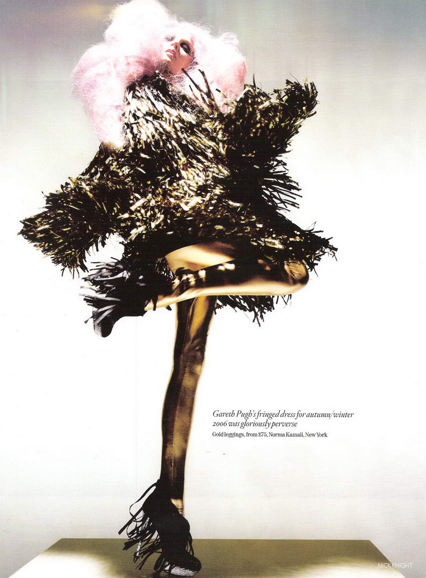
Above, is an image from Knights "Unbelievable Fashion" shoot for Vougue UK. The image consists of 3 seperate images merged into one to create a dramatic and unusual shot.
For me, the main focus of this image is the dress in the centre and the other two models seem to frame it by the shapes of their clothes and bodies. The colours, although very different, work very well because tone wise, they are similar. The vibrancy of the models on either side means that they don't fade into the background and they stand out in their own right. Looking at their body shapes you notice a pattern in the way they are standing... suggestively without even seeing the shape of the girl in the middle dress you get the idea that she is standing in a similar stance.

The image gives off an air of dance, the girls are in a row, mirroring shapes - line dancing in a sense. This gives off the playful and vibrant design that the clothing is trying to portray. The idea of the shoot is to show fashion that has been done and that will remain a stable in everyday life. Although the items are bizaar and quirky, they are in essence very tradional and are clearly based on fashion throughout the years. Lace, big skirts, shoulder pads, feather bowers are all things that have been fashionable and interesting throughout the years.

I looked at several other images within the same shoot;

and noted down factors such as poses and lighting. Each image seems to follow with the bent leg and each model, although from a different shoot, fits in well with the other. Some images have a more obvious take on the pose;


But every image works together and is clearly associated with eachother. The lighting is dusky and picks up on important elements on the clothing - it defines the detail very well and clearly shows that the shoot is about the clothing and not the model wearing it. The model looks effortlessly beautiful without evening being able to see their face, often because a viewer is drawn to the face of a person out of interest but here, that has been avoided. Layering images together in such an obvious way i.e. not merging together the flooring or colours adds an interesting twist to the usual way photography and especially editorial photography is portrayed. These images are fun, enjoyable, and interesting. The bursts of colour and matching tones allow the images to be so different but yet follow a suit which would work really well in a layout design.

Aside from this, I feel the poses which have been used and continued on in every image reflect a lot about the time of each tradition. For example, the outfits are clearly for the more indulgent figures of the era and the over dramatic way they are portrayed definitley shows this. I feel that they simbolise a "my fair lady" with a modern twist.


Images and evaluations

Above, is a random image of Llawen. Originally, this image was just a test to see how the lighting was against the back drop, but when I connected it to the computer I decided to play about with it and came up with this.

The image as a whole is a nice, simple, cold looking portraight, I feel it doesnt portray much about the personality of the person but the image is suggestive. The cold greys work well with the image and give it a sense of depth and drama. It's a very 'still' image, it could almost be painted, and because of this, the eye is drawn to the subject himself. The darkened areas on Llawens face make the image sharper and more crisp, althought perhaps a slight bit of work could be done with the facial area to bring out the features more, perhaps burning in a few colours.

The image might have benefitted from less saturation, however in addition to that on some level I feel the coldness of the image works, it sets it apart from a boring portrait. It looks almost as if a sheen of colour has been placed over it to take away certain colours. I think this type of editing could work well with a set of images to perhaps portray a persons outter shell without letting the viewer in to the subjects personality etc. If you didn't know Llawen, i think it would be difficult to establish much about him from this image and that's why I like it - because it means that the viewer will wonder as thats what I'd want people to do.

I think it's more of an editorial piece over an artistic piece, you're more likely to see it on billboards advertising a make of clothing rather than in a gallery, but in a whole it's a good image. I have the composition right in the sense that the head room between Llawens head and the top of the image isn't too much or too little, he's centred in the image and symmetrical in his stance, which works wel also - it keeps the image balanced.


The magazine I chose to base the idea for our band on was IP1. I chose this because it's local, simple, interesting and appeals to the youth market. I looked through copies of the magazine and on www.ip1zine.com and had a look at a few of their page layouts and styles. From writing for the magazine, I understand that every word is valued and band shoots and interviews are a favourite and a regular slot in the issues.

The boys seemed laid back and easy about what they do, success wasn't their first goal and they said they just wanted to make people happy. Therefore, I decided a local, less commercial magazine was the way forward.

With my first finished product (red background), I am quite pleased. However, it is slightly overpowered by text. To overcome this I could potentially take out a few questions and answers and insert a few captions and comments related to the text. The photographs on the first page I feel work well. The boys wanted to do a shoot with a red phone box, however, which I found more difficult to put into an editorial context. The photos as an individual image were very rough and needed a lot of editing and adjusting to fit into a decent format to place in a magazine spread.

These type of photos I feel would not really be seen in magazines. Location shots may have worked better, or, with more planning we could have come up with better ideas. I feel us as photographers and the band did not explore the creativity that can come from these kind of shoots enough. The layout on the first page is definitely a lot better than the layout on the second page, perhaps using a double page and one single page would have worked better and in hindsight, it's easy to say these things.

The writing could be broken up a bit, possibly even only using the text from the first page and expand it out over the spread. it was my first attempt at designing a magazine and I found it harder than I originally imagined. Currently, I am in the process of making several other designs using different images to experiment and play around with types of layouts I could use.


This is one of my favourite images that I've taken - a shame that it's in such poor quality (taken on an iPod Nano) but I love how this image is almost a mirror image of itself. It was on the train to falmouth where I enjoy watching the orange and red cliffs roll past and thought about how it's weird how between the sea and the cliffs there's a random train track.

This image again, was by chance and in turn, I feel it works really well. The mans arm represents a mirrored image of the cliff outside, while the train window mirrors the train track and the dark blue colours within the train mirror the sky outside. It's a reference to how natural beauty goes so unignored these days and how it's often ruined by man-made builds. The image has beautiful colours within it, bright blue sky with loads of clouds, bold oranges and yellows - a contrast to the dull colours within the train.

Composition wise this image doesn't quite conform, but it's awkward and sparks thoughts in the viewers mind. Why would anyway take a random photo of half a train, half a cliff? If you look into the image you can see there is more to it than that. I did conform to the rule of thirds though so various parts of the image draw your eyes in to different points. I'd want this image to calm and relax people in the same way the train journey does to me.

Editing would have done this image little justice, because the quality is so distorted I feel it would have made the image hard to distinguish if any other different lights or effects were added over it. I think it relates quite well to the gorgeous work of Philippe Sainte-Laudy http://www.smashingmagazine.com/2008/11/30/50-beautiful-examples-of-reflections-photography/ <- work seen here, who focuses on images of reflection. 
Although I'm sure his work was probably a lot more well planned out than this quick snap shot. 

The image would definitley be even better if it was better quality, but sometimes spur of the moment shots work better than those that have been captured after days of waiting. A series of image taken with the same camera using similar methods of looking through a window or reflecting something would make a lovely thing to view, afterall, not everything has to be perfect. The roughness of the image kind of reflects the content within the image also, but I think this would have been beautiful taken on a film SLR. Black and white with the grainy paper would really add to this image, perhaps something I could toy with if i were ever to make this journey again.

Live Event images


Performing Arts photography shoot