Who is he?
Nick Knight OBE is a British photographer specialising in fashion and documentary images. He is a director of SHOWstudio.com
DOB?
He was born in 1958.
What work has he done?
His first book; 'Skinheads', was published in 1982.
After this, he was commissioned by i-D magazine editor Terry Jones to create a series of 100 portraits for the magazines 5th Anniversary issue.
This caught the attention of art director Marc Ascoli who then commissioned Knight to shoot the 1986 catalogue of Japanese designer Yohji Yamamoto.
Since breaking into the world of fashion and editorial photography he has done shoots for clients such as Alexander McQueen, Audi, Calvin Klein, Dior, Lancome, Levi Stauss, Mercedes Benz, Royal Opera House, YSL and the list continues.
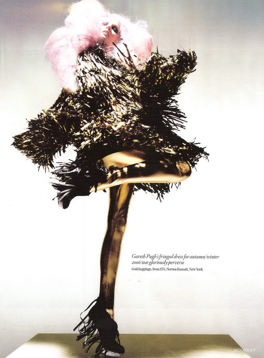
Above, is an image from Knights "Unbelievable Fashion" shoot for Vougue UK. The image consists of 3 seperate images merged into one to create a dramatic and unusual shot.
For me, the main focus of this image is the dress in the centre and the other two models seem to frame it by the shapes of their clothes and bodies. The colours, although very different, work very well because tone wise, they are similar. The vibrancy of the models on either side means that they don't fade into the background and they stand out in their own right. Looking at their body shapes you notice a pattern in the way they are standing... suggestively without even seeing the shape of the girl in the middle dress you get the idea that she is standing in a similar stance.
The image gives off an air of dance, the girls are in a row, mirroring shapes - line dancing in a sense. This gives off the playful and vibrant design that the clothing is trying to portray. The idea of the shoot is to show fashion that has been done and that will remain a stable in everyday life. Although the items are bizaar and quirky, they are in essence very tradional and are clearly based on fashion throughout the years. Lace, big skirts, shoulder pads, feather bowers are all things that have been fashionable and interesting throughout the years.
I looked at several other images within the same shoot;
and noted down factors such as poses and lighting. Each image seems to follow with the bent leg and each model, although from a different shoot, fits in well with the other. Some images have a more obvious take on the pose;
But every image works together and is clearly associated with eachother. The lighting is dusky and picks up on important elements on the clothing - it defines the detail very well and clearly shows that the shoot is about the clothing and not the model wearing it. The model looks effortlessly beautiful without evening being able to see their face, often because a viewer is drawn to the face of a person out of interest but here, that has been avoided. Layering images together in such an obvious way i.e. not merging together the flooring or colours adds an interesting twist to the usual way photography and especially editorial photography is portrayed. These images are fun, enjoyable, and interesting. The bursts of colour and matching tones allow the images to be so different but yet follow a suit which would work really well in a layout design.
Aside from this, I feel the poses which have been used and continued on in every image reflect a lot about the time of each tradition. For example, the outfits are clearly for the more indulgent figures of the era and the over dramatic way they are portrayed definitley shows this. I feel that they simbolise a "my fair lady" with a modern twist.


No comments:
Post a Comment